DIFFERENT BUSINESSES ◆ DIFFERENT PROBLEMS ◆ DIFFERENT WEBSITES
THE WORK. And the thinking behind it.
A financial planner, a gaming guild, a veterans support organisation and a personal brand have absolutely no reason to look like they came off the same template conveyor belt. So they don't.
GAMING ◆ COMMUNITY ◆ CUSTOM BUILD
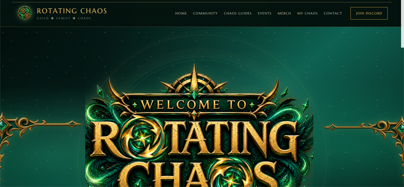
ROTATING CHAOS.
WHAT IS IT?
Rotating Chaos is a Neverwinter gaming guild built around community, teamwork, dungeon content and an impressive ability to turn organised gameplay into complete chaos.
THE BRIEF
Build a guild website that feels like the people actually using it. It needed to house class builds, dungeon mechanics, guild information, events and community content without becoming one enormous wall of gaming information.
THE CHALLENGE
There is a lot of information. A lot. The site needed enough fantasy personality to belong in Neverwinter, while still making it ridiculously easy for members to find the guide or mechanic they came looking for.
THE APPROACH
A dark fantasy identity, strong gold and cream contrast, custom visual assets, clear navigation and reusable layouts for builds and dungeon mechanics. The visual design creates atmosphere. The structure stops the atmosphere becoming a bloody maze.
WHAT IT NEEDED TO DO
Feel unmistakably Rotating Chaos, support a growing library of useful content and remain easy enough for guild members to actually use mid-game.
FINANCIAL SERVICES ◆ WEBSITE RESCUE ◆ REDESIGN
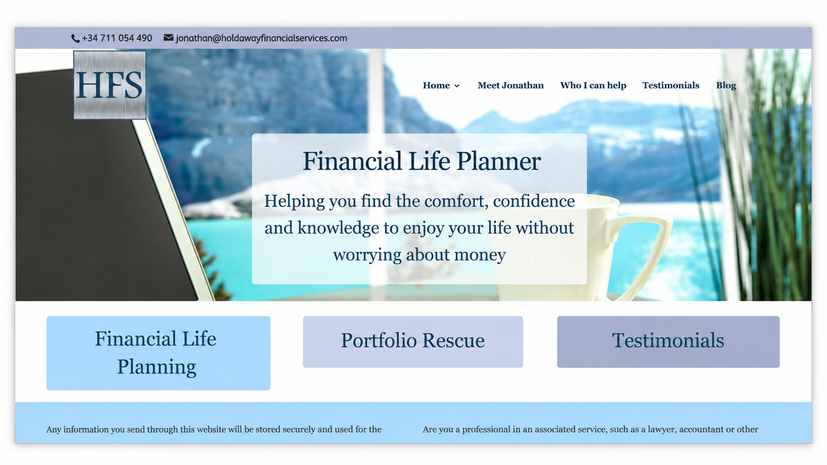
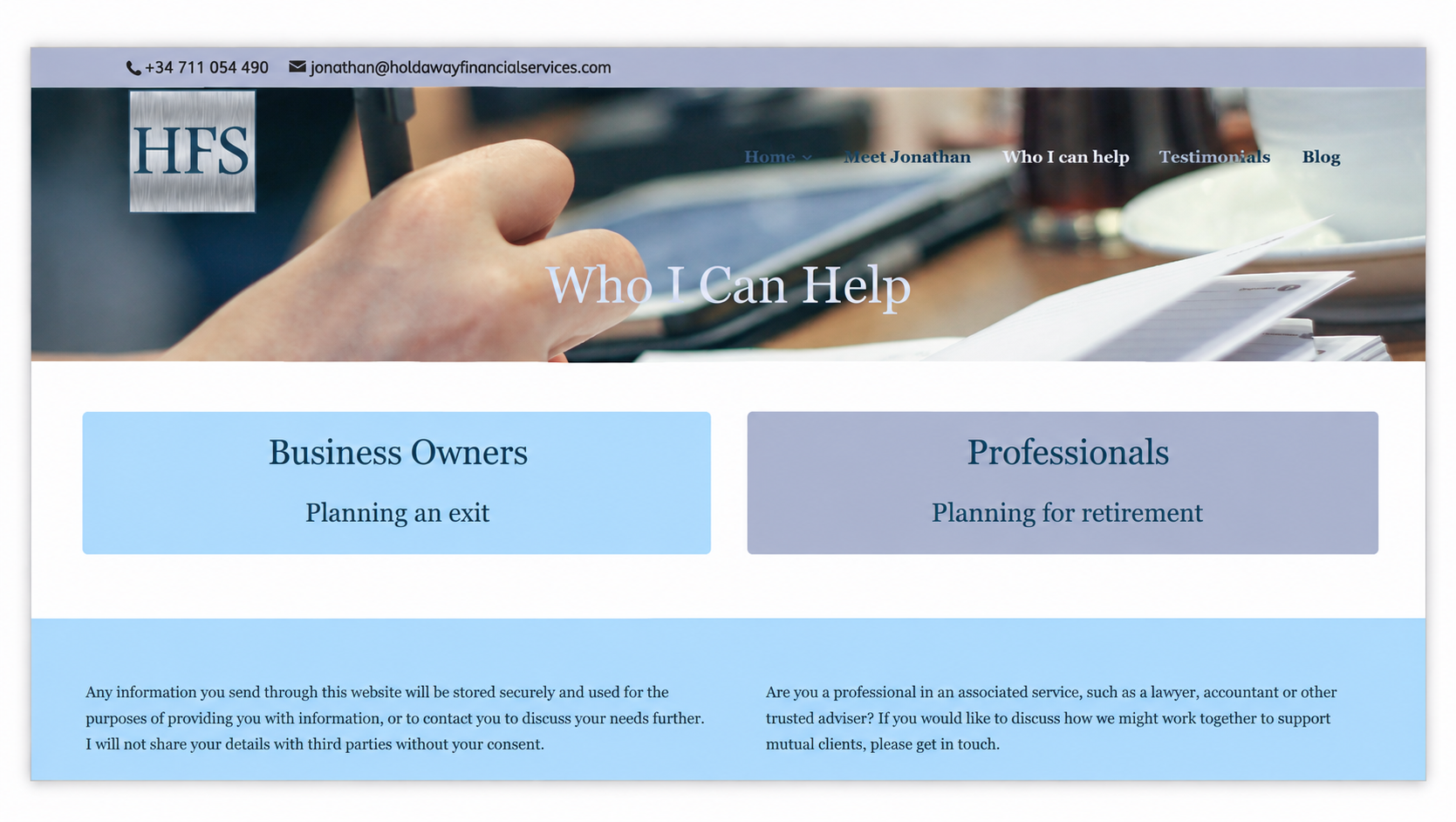
HOLDAWAY FINANCIAL SERVICES.
WHAT IS IT?
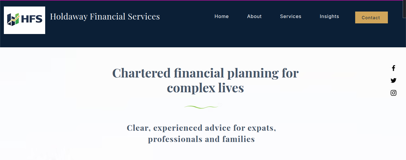
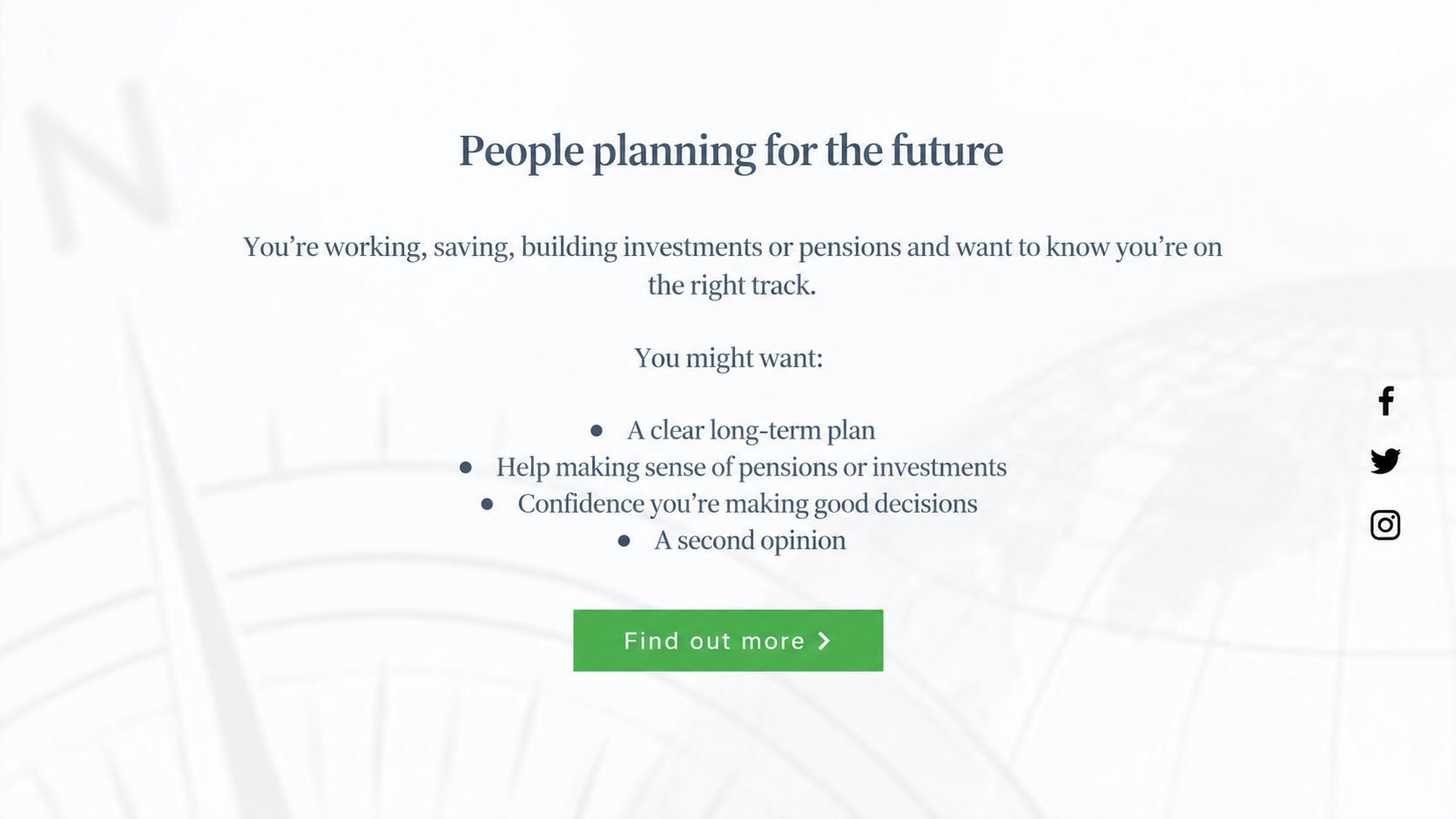
Holdaway Financial Services is a financial planning business helping clients understand their options and make informed decisions about their finances.
THE BRIEF
The technical version? Redesign the existing website so it better reflects the quality, credibility and personality of the business.
The less technical version: “Please sort this website out.” 😂
THE PROBLEM
The existing site did its basic job, but visually it felt dated, generic and much more corporate than the business itself. The expertise was there. The website simply wasn't representing it particularly well.
THE APPROACH
Keep the credibility financial services needs, without making visitors feel like they've accidentally wandered into a bank's annual report. The rebuild introduced clearer structure, stronger typography, cleaner content hierarchy and a warmer, more modern visual identity.
WHAT IT NEEDED TO DO
Look established and trustworthy, make financial information easier to navigate and feel considerably more like the actual people behind the business.
PERSONAL BRAND ◆ STORYTELLING ◆ COACHING
FLAMINGO RISE.
WHAT IS IT?
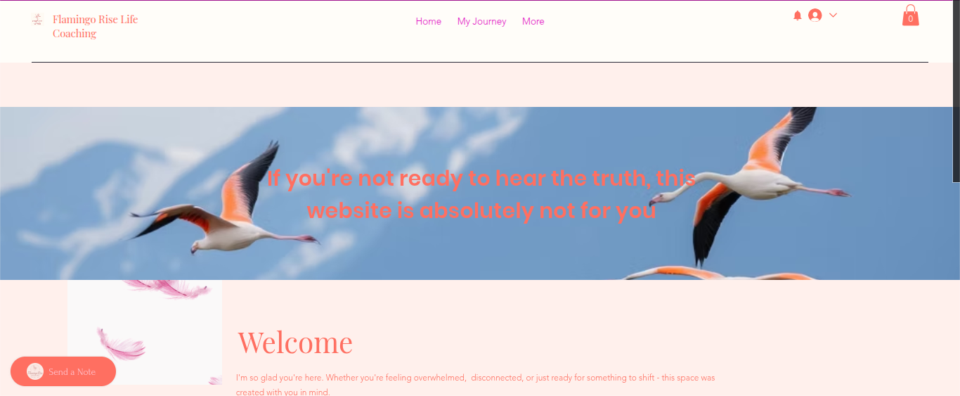
Flamingo Rise is a personal, emotionally-led brand centred around growth, lived experience, encouragement and connection.
THE BRIEF
Create something warm, approachable and personal. The site couldn't feel like a generic coaching template with a stock photograph of somebody staring thoughtfully at a mountain.
THE CHALLENGE
Personal brands need personality, but they also need enough structure to stop the website becoming a diary. The story needed room to breathe while still guiding visitors towards the important information.
THE APPROACH
Softer colours, warmer typography, personal storytelling and more emotional visual pacing. Completely different from Rotating Chaos because it should be.
WHAT IT NEEDED TO DO
Create trust, make the person behind the brand visible and give the business an online identity that feels genuinely personal.
VETERANS SUPPORT ◆ INFORMATION ◆ ORGANISATION
VETERANS BACKBONE.
WHAT IS IT?
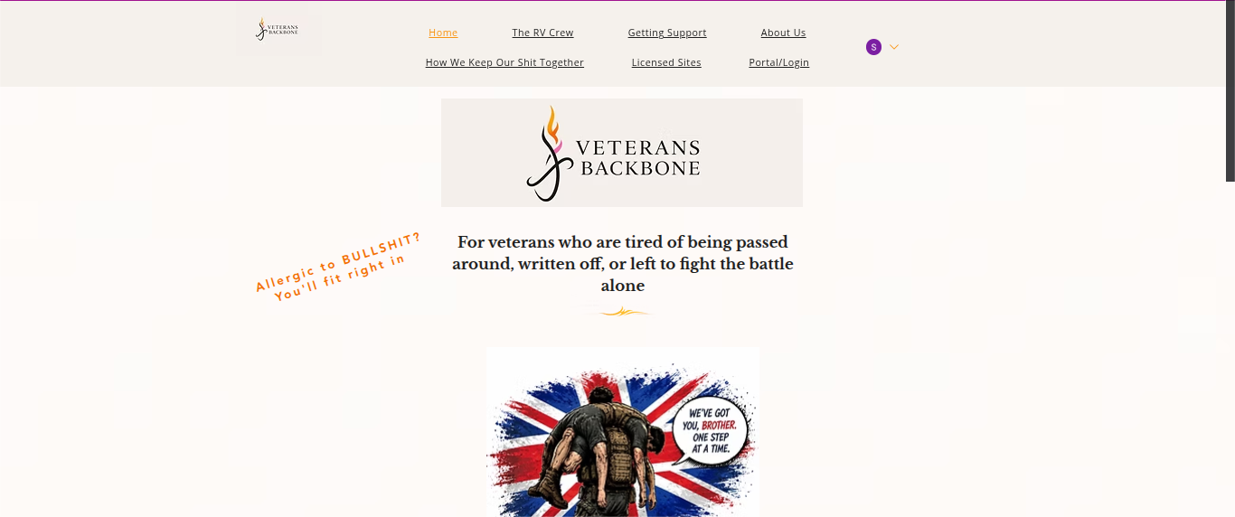
Veterans Backbone is a support organisation designed around helping veterans find practical support, understand what is available and reach the right people.
THE BRIEF
Build a support website that feels human and direct without looking like another institutional charity website.
THE CHALLENGE
Support websites can contain a huge amount of information. The site needed to make that information accessible without overwhelming someone who may already be looking for help in difficult circumstances.
THE APPROACH
Clear navigation, strong information hierarchy, plain language and a distinctive visual identity. Serious where it needs to be. Human everywhere else.
WHAT IT NEEDED TO DO
Help people find information quickly, explain what the organisation actually does and create trust without becoming cold, clinical or unnecessarily formal.
THE WHOLE POINT
I DON'T HAVE A HOUSE STYLE.
I have a way of working. The business decides the look. The audience decides the structure. The content decides what needs space. The personality decides the feel. That's why these websites don't look like siblings wearing matching outfits.
GOT YOUR OWN “SORT THIS SHIT OUT” PROJECT?